22 Gallery Wall Living Room Ideas That Won’t Look Like a Mistake
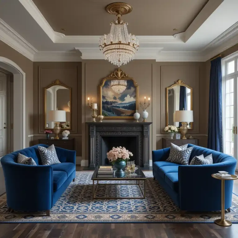
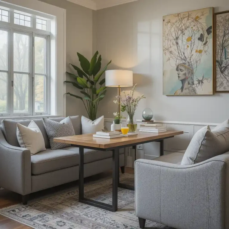
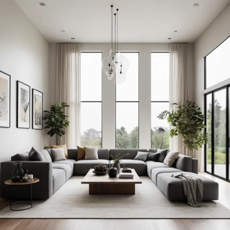
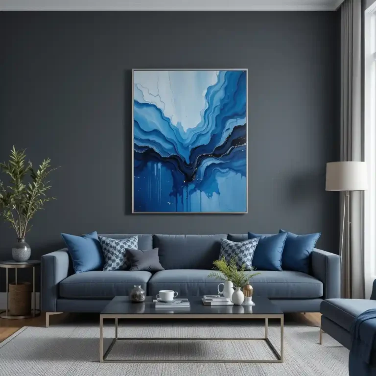
A living room gallery wall instantly transforms an empty backdrop into a curated, designer-level focal point, but hanging multiple frames without a clear plan often leads to crooked lines and a wall full of misplaced nail holes. The two most common mistakes are hanging art too high above eye level and using mismatched spacing that makes the collection feel messy rather than intentional. The secret to a cohesive gallery wall is locking down a 2 to 3 inch uniform gap between frames, centering the entire arrangement 57 to 60 inches from the floor, and keeping the total layout to roughly two-thirds of your sofa’s width. Below are 22 gallery wall living room ideas designed around strict spacing formulas, renter-friendly mounting tricks, and balanced frame layouts that elevate your space.
Gallery Wall Layout Selector
Every gallery wall starts as one of a few basic archetypes. Figure out which one fits your space and your patience level before you buy a single frame.
| Layout Archetype | Frame Uniformity | Hanging Effort | Best Living Room Style |
|---|---|---|---|
| Symmetrical Grid | Identical frames, matching mats | Moderate, precise measuring required | Modern, minimalist, formal |
| Eclectic Salon | Mixed sizes and finishes | Higher, more trial and error | Boho, vintage, warm |
| Picture Ledge or Shelf | No fixed frames, fully swappable | Easy, minimal wall damage | Renter-friendly, casual |
| Asymmetrical Corner | Mixed sizes, irregular shape | Higher, needs a steady eye | Eclectic, artistic |
1. 9-Frame Symmetrical Neutral Grid over the Sofa
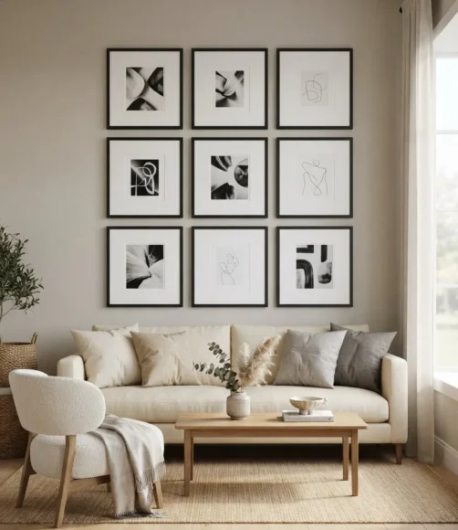
Feels like · a boutique hotel lobby wall
Nine identical frames in a tight 3 by 3 grid is the most forgiving layout for a first attempt, since the uniformity does most of the visual work for you.
The Gallery Vibe: Symmetrical architectural grid, calm and precise.
Layout and Spacing Rule: 2 inch uniform gap between every frame, whole grid centered at 58 inches, total width at 70 percent of the sofa.
Frame and Art Pairing Detail: Matte black frames with a 2 inch white mat, mixed black and white photography and simple line art.
2. Organic Mixed-Frame Vintage Wall with a Center Anchor
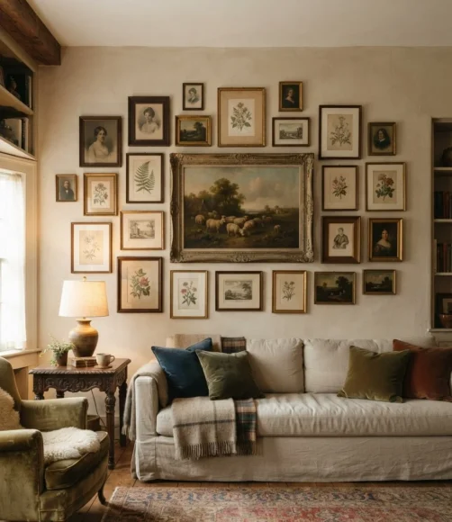
Feels like · a wall collected over twenty years, not a weekend
Building outward from one large anchor piece gives an eclectic wall structure, so the mismatched frames around it still read as a single considered arrangement.
The Gallery Vibe: Warm eclectic salon, layered and personal.
Layout and Spacing Rule: Anchor piece centered at 57 inches, surrounding frames at a 2 to 3 inch gap, radiating outward from that center.
Frame and Art Pairing Detail: Mixed wood tones and gold finishes, a blend of vintage prints, small portraits, and one oil painting as the anchor.
The 57-Inch Eye-Level and 2/3 Sofa Width Formula
Museums hang art at eye level for a reason, and the same math works in a living room. The center point of your whole gallery wall arrangement, not the top edge, should land between 57 and 60 inches from the finished floor. That number stays constant whether you have 8 foot or 10 foot ceilings, since it is based on average standing eye height, not room proportions.
Width matters just as much as height. Your total gallery wall should span roughly two-thirds of your sofa’s width, somewhere between 60 and 75 percent, so an 84 inch sofa calls for a gallery closer to 55 to 63 inches wide rather than a narrow 40 inch cluster that looks lost above it. Leave 6 to 8 inches of breathing room between the top of your sofa cushions and the bottom edge of the lowest frame. I have seen more than one gallery wall get hung almost at ceiling height because the person kept working upward frame by frame without ever measuring the true center, and by the time they stepped back the whole thing looked like it was trying to escape the room.
3. Dual Floating Picture Ledge Gallery
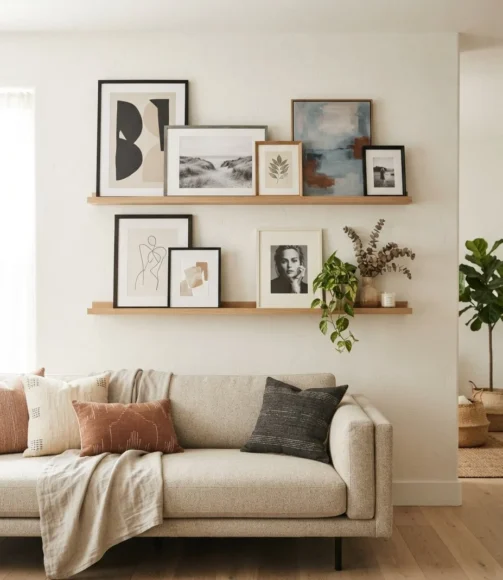
Feels like · an art studio that changes with the seasons
Leaning frames on floating ledges instead of nailing each one lets you swap and rearrange the display anytime the mood strikes, without a single new hole in the wall.
The Gallery Vibe: Modern picture ledge, effortless and ever-changing.
Layout and Spacing Rule: Two ledges stacked 10 inches apart, lower ledge centered near 55 inches to keep the visual weight low.
Frame and Art Pairing Detail: Overlapping frames in varied widths, mixing thin black frames with natural oak.
4. Black and White Family Photo Grid with Oversized White Mats
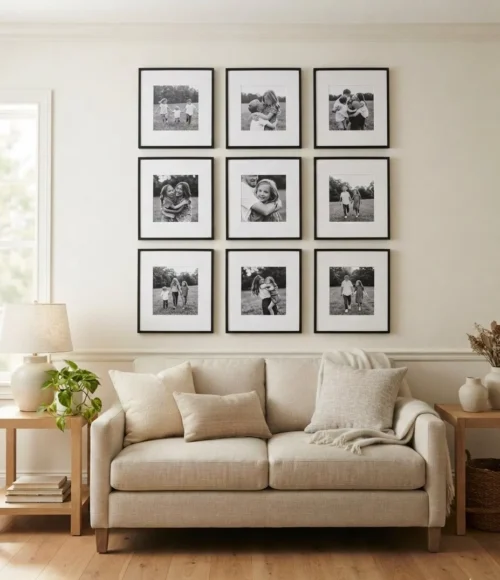
Feels like · flipping through a beautifully edited family album
An oversized mat around each photo gives even a small snapshot real gallery presence, and the extra white space keeps a wall of many faces from feeling busy.
The Gallery Vibe: Warm eclectic salon, deeply personal.
Layout and Spacing Rule: 3 inch gap between frames, grid centered at 58 inches, total width at 65 percent of the sofa.
Frame and Art Pairing Detail: Simple black frames, 3 inch white mats, black and white candid photos mixed with a few color prints.
5. TV-Surround Gallery Wall
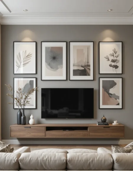
Feels like · the TV finally belongs in the room’s design
Framing the television with smaller art on either side keeps it from sitting alone as a black rectangle, folding it into the overall composition instead.
The Gallery Vibe: Symmetrical architectural grid, built around a functional anchor.
Layout and Spacing Rule: Frames aligned to the top and bottom edge of the TV, 3 inch gaps, entire cluster no wider than the TV plus 12 inches on each side.
Frame and Art Pairing Detail: Matching thin black frames, abstract prints that stay simple enough not to compete with the screen.
6. Brass and Wood Mixed-Frame Salon Cluster
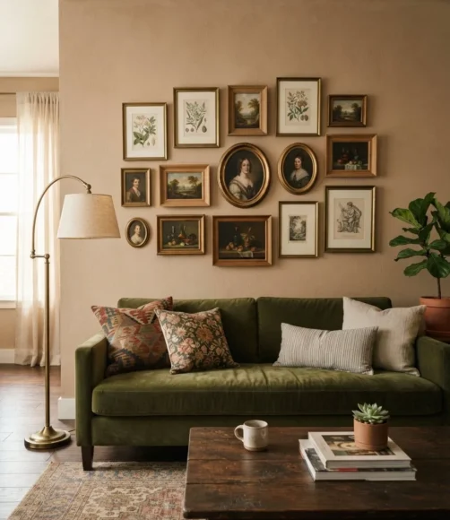
Feels like · a well-traveled collector’s study
Limiting yourself to just two finishes, brass and wood, keeps a mixed cluster from tipping into visual chaos even with a dozen different frame shapes involved.
The Gallery Vibe: Warm eclectic salon, rich and layered.
Layout and Spacing Rule: 2 to 3 inch varied gaps, cluster centered around 57 inches, kept to 65 percent of the sofa’s width.
Frame and Art Pairing Detail: Only brass and natural oak finishes, mixing botanical prints with small oil paintings.
7. Botanical Print Collection Grid
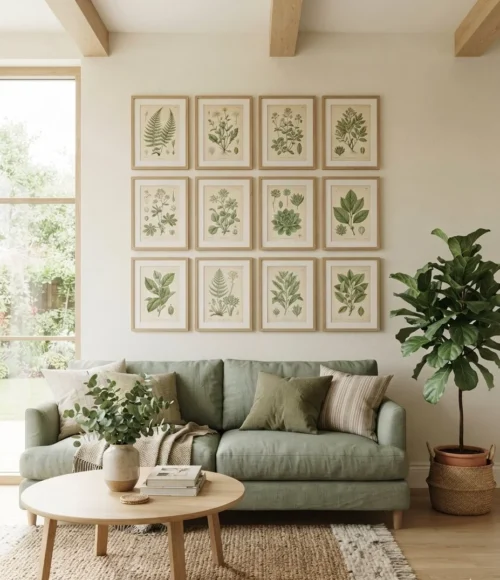
Feels like · a sunlit conservatory reading nook
A shared green palette across every print lets you mix ferns, succulents, and florals freely without the wall ever reading as scattered.
The Gallery Vibe: Symmetrical architectural grid, calm and nature-forward.
Layout and Spacing Rule: 2 inch uniform gap, grid centered at 58 inches, width matched to 70 percent of the sofa.
Frame and Art Pairing Detail: Thin natural wood frames, botanical illustrations sharing one consistent green tone.
8. Round and Rectangular Mixed Shape Wall
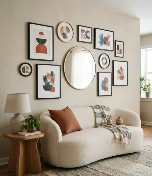
Feels like · a gallery that refuses to play it safe
Mixing round frames or mirrors into a mostly rectangular grid adds genuine visual rhythm, as long as you keep the round shapes consistent in size with each other.
The Gallery Vibe: Asymmetrical corner, playful and contemporary.
Layout and Spacing Rule: 3 inch minimum gap since round frames need extra visual room, centered at 57 inches.
Frame and Art Pairing Detail: A round mirror as one anchor point, rectangular art prints filling the rest in matte black.
The Butcher Paper Zero-Mistake Hanging Hack
Before a single nail goes into the wall, trace the outline of every frame onto butcher paper or plain craft paper, cut each shape out, and stick the paper cutouts to the wall using blue painter’s tape. This lets you slide, adjust, and completely rearrange the layout as many times as you need, with zero commitment and zero holes. Use a small level to keep everything straight, and stand back across the room every few minutes to check the overall balance rather than only looking up close.
Once the paper layout finally looks right, mark the exact nail point through the paper itself before peeling it away, so your hammer goes in the correct spot on the first try. I have watched someone skip this step and end up with eleven nail holes for a nine-frame wall, patching two extra holes is a small annoyance, but the tape and paper method costs you nothing more than twenty minutes and saves that frustration entirely. If you want another gallery layout to study before you commit, these corner wall gallery ideas show how the same spacing principles adapt to an awkward corner.
9. Brass Vintage Thrifted Salon Wall
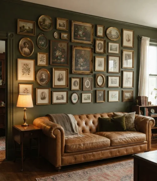
Feels like · a Sunday spent digging through estate sales
Real thrifted brass frames carry small dents and tarnish spots that no new frame can fake, and that history is exactly what makes a salon wall feel genuinely collected.
The Gallery Vibe: Warm eclectic salon, unmistakably vintage.
Layout and Spacing Rule: Varied 2 to 3 inch gaps, arrangement centered at 57 inches, kept to 60 percent of the sofa’s width.
Frame and Art Pairing Detail: All aged brass in varying sizes, a mix of small oil paintings and vintage botanical prints.
10. Floor-to-Ceiling Corner Wrap Gallery
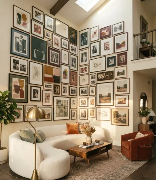
Feels like · walking into a private gallery opening
Wrapping the arrangement around an actual corner turns two ordinary walls into one continuous story, which is a genuinely bold move for a room with real ceiling height to spare.
The Gallery Vibe: Asymmetrical corner, dramatic and immersive.
Layout and Spacing Rule: Denser near the corner seam, thinning outward, keep the eye-level cluster still centered near 57 inches.
Frame and Art Pairing Detail: Mixed black and wood frames, a blend of large statement pieces and small supporting prints.
11. Botanical Illustration Collection
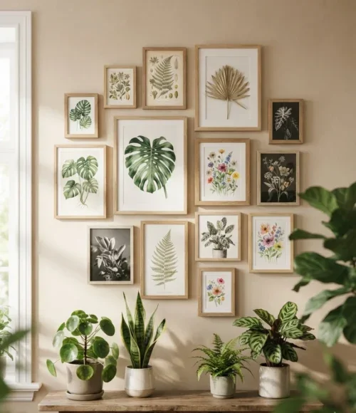
Feels like · a pressed-flower journal from a 19th century naturalist
Antique-style botanical illustrations in thin gold frames feel refined without ever tipping into fussy, especially arranged in a tight, evenly spaced grid.
The Gallery Vibe: Symmetrical architectural grid, elegant and scholarly.
Layout and Spacing Rule: 2 inch uniform gap, centered at 58 inches, width at 65 percent of the sofa.
Frame and Art Pairing Detail: Thin gold frames, antique-style botanical plate illustrations with cream matting.
12. Minimalist Two-Frame Oversized Diptych
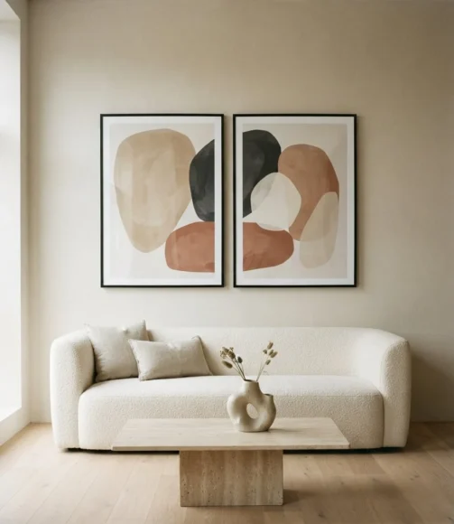
Feels like · a single confident design decision
Two oversized frames prove that a gallery wall does not need many pieces to feel intentional, sometimes restraint reads as more confident than a full grid ever could.
The Gallery Vibe: Minimalist symmetrical pairing, quiet and modern.
Layout and Spacing Rule: 4 inch gap between the two large frames, pairing centered at 58 inches, together spanning 65 percent of the sofa.
Frame and Art Pairing Detail: Matching oversized black frames, a single abstract print split intentionally across both, or two related pieces.
13. Matte Black Uniform Grid Wall
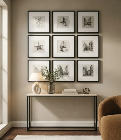
Feels like · a crisp architectural sketchbook
An all-black frame grid over a console table works especially well in a smaller vignette that does not need the full width of a sofa wall.
The Gallery Vibe: Symmetrical architectural grid, sharp and modern.
Layout and Spacing Rule: 2 inch gap, grid centered at 58 inches, width at 70 percent of the console below it.
Frame and Art Pairing Detail: Uniform matte black frames, black and white line drawings or simple graphic prints.
14. Warm Oak Frame Family Timeline Wall
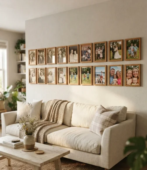
Feels like · flipping through years in a single glance
Arranging family photos in a single horizontal row, oldest to newest, turns the wall into a genuine timeline rather than just a random cluster of memories.
The Gallery Vibe: Warm eclectic salon, sentimental and structured.
Layout and Spacing Rule: 3 inch even gaps in a single row, row centered at 58 inches.
Frame and Art Pairing Detail: Matching warm oak frames, photos arranged chronologically left to right.
15. Mixed Media Textile and Print Salon Wall
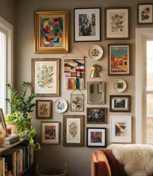
Feels like · a weaver’s studio full of texture
Framing a woven textile alongside flat prints adds real dimension a wall of only paper art can never achieve, giving the whole cluster tactile depth.
The Gallery Vibe: Warm eclectic salon, textural and handmade.
Layout and Spacing Rule: 3 inch minimum gap to give the textile piece room to breathe, centered at 57 inches.
Frame and Art Pairing Detail: Deep-set shadow box for the woven piece, natural wood frames for the surrounding prints.
16. Monochrome Architectural Print Grid
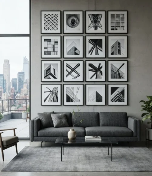
Feels like · a skyline seen from a rooftop bar
Sharp architectural lines in black and white photography echo clean modern furniture in a way that colorful or busy prints simply cannot match.
The Gallery Vibe: Symmetrical architectural grid, urban and sleek.
Layout and Spacing Rule: 2 inch uniform gap, centered at 58 inches, width at 70 percent of the sofa.
Frame and Art Pairing Detail: Thin matte black frames, black and white cityscape and building detail photography.
17. Command-Strip Renter-Friendly Cluster
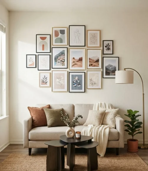
Feels like · a design win that gets your deposit back
Heavy-duty adhesive strips rated for the actual weight of your frames can hold an entire cluster with zero nail holes, which matters a lot when you are renting.
The Gallery Vibe: Symmetrical grid or light salon mix, whichever suits your frames.
Layout and Spacing Rule: Same 2 to 3 inch gap rule applies, use the butcher paper method first since strips are harder to reposition than nails.
Frame and Art Pairing Detail: Keep individual frames under 5 pounds, lightweight poster frames or thin metal frames work best.
18. Circular Frame Constellation Wall
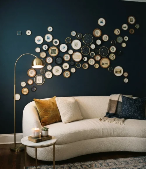
Feels like · looking up at a scattered night sky
Small round frames scattered rather than gridded read as playful and a little unexpected, a nice change from the standard rectangle grid most people default to.
The Gallery Vibe: Asymmetrical corner, whimsical and light.
Layout and Spacing Rule: Irregular 3 to 5 inch gaps, densest cluster centered near 57 inches, thinning outward.
Frame and Art Pairing Detail: Small round frames in varied sizes, a mix of finishes tied together by a shared thin profile.
19. Layered Leaning Ledge Display
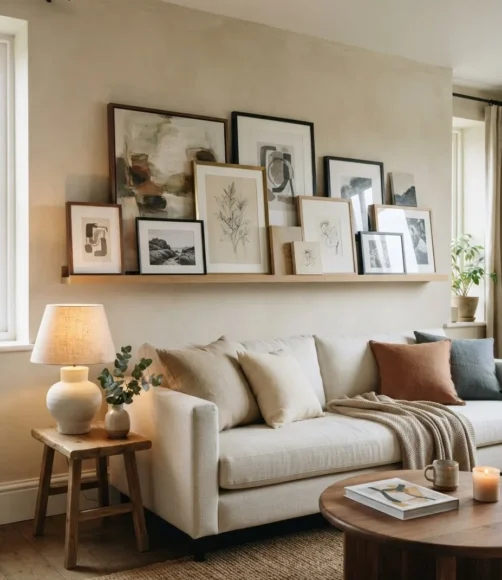
Feels like · a stylist’s own effortlessly styled home
Deliberately overlapping frames at different depths on a single ledge creates a layered look that feels lived-in and gathered rather than staged all at once.
The Gallery Vibe: Modern picture ledge, casual and layered.
Layout and Spacing Rule: Single ledge at 55 to 58 inches, frames overlapping by a third rather than spaced evenly.
Frame and Art Pairing Detail: A deliberate mix of frame depths and finishes so the overlap reads intentionally layered.
20. Large Anchor Print with Small Satellite Frames
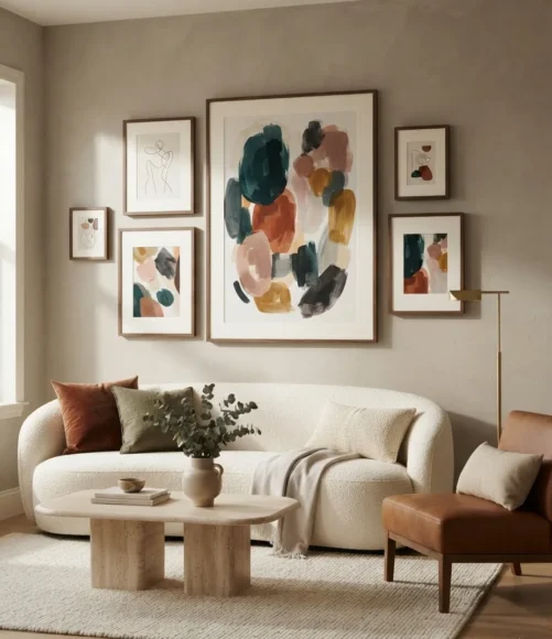
Feels like · a gallery opening built around one showstopper
One genuinely large piece surrounded by smaller supporting frames gives a room a confident focal point without needing an entire grid to fill the wall.
The Gallery Vibe: Asymmetrical corner, bold and confident.
Layout and Spacing Rule: Anchor piece centered at 57 inches, satellite frames at 2 to 3 inches out from its edges.
Frame and Art Pairing Detail: One oversized abstract or photographic print, a handful of small matching frames in the same finish.
21. Symmetrical Gold Frame Grid over a Console
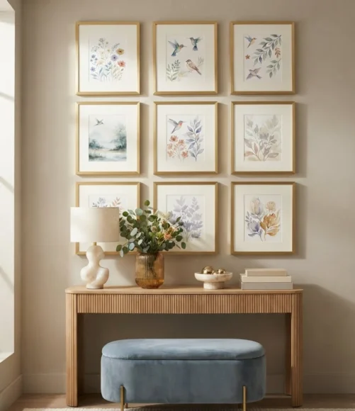
Feels like · a glamorous 1920s drawing room
Gold frames in a tight symmetrical grid over a console table bring real polish to a smaller vignette, especially paired with a mirror or a lamp nearby.
The Gallery Vibe: Symmetrical architectural grid, glamorous and refined.
Layout and Spacing Rule: 2 inch gap, grid centered around 58 inches, width matched to the console below it.
Frame and Art Pairing Detail: Matching thin gold frames, art deco-inspired geometric prints.
22. Eclectic Travel Memorabilia Salon Wall
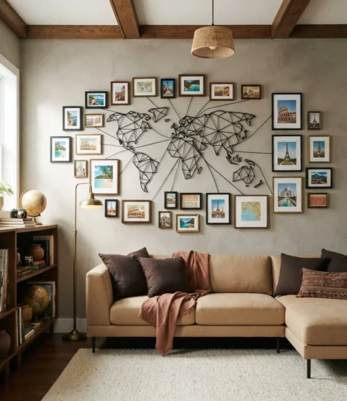
Feels like · a passport full of stamps turned into art
Framing real tickets, maps, and postcards from actual trips turns this wall into a genuine travel journal rather than something anyone could buy off a shelf.
The Gallery Vibe: Warm eclectic salon, personal and well-traveled.
Layout and Spacing Rule: Varied 2 to 3 inch gaps, arrangement centered at 57 inches, kept to 65 percent of the sofa’s width.
Frame and Art Pairing Detail: Mixed thin black and wood frames, real maps, tickets, and travel photography rather than purchased prints.
Cost, Frame Count, and Renter Friendliness at a Glance
| Gallery Wall Project | Approx Cost | Frame Count | Renter Friendliness |
|---|---|---|---|
| Picture Ledge Shelf Gallery | $80 to $200 | 6 to 12 pieces, swappable | Excellent, no wall damage |
| Symmetrical Grid, Uniform Frames | $150 to $400 | 6 to 9 matching frames | Good with rated command strips |
| Eclectic Salon Wall | $200 to $600 or more | 12 to 20 mixed frames | Moderate, more holes needed |
| Two-Frame Minimalist Diptych | $100 to $350 | 2 oversized frames | Good, minimal holes required |
Frequently Asked Questions
How high should a gallery wall hang above a sofa?
Center the whole arrangement 57 to 60 inches from the finished floor, and leave at least 6 to 8 inches of clearance between the top of the sofa cushions and the bottom edge of the lowest frame.
How far apart should frames be on a gallery wall?
Keep a uniform 2 to 3 inch gap between frames for most layouts, going up to 4 inches maximum for very large frames. Consistent spacing is what makes a wall of different pieces still read as one cohesive collection.
How do you hang a gallery wall without nails?
Use heavy-duty adhesive strips rated for your specific frame weight, or skip fixed mounting entirely with a floating picture ledge that lets frames lean and overlap without any hardware at all.
How wide should a gallery wall be over a sofa?
Aim for roughly two-thirds of your sofa’s width, somewhere between 60 and 75 percent. Much narrower and the arrangement looks lost, much wider and it starts to overwhelm the furniture beneath it.
Do all the frames need to match?
No. Many of the most visually interesting gallery walls mix frame styles and finishes on purpose, as long as some shared thread, like color, spacing, or subject matter, ties the whole wall together.
Final Thoughts
A gallery wall succeeds or fails on measurements most people never think to check, the 57 inch center height, the 2 to 3 inch spacing, and the two-thirds sofa width ratio. Lock those three numbers down with the butcher paper method before a single nail goes in, and even a wildly eclectic mix of frames will read as intentional rather than accidental. Whether you land on a strict symmetrical grid or a loose, collected salon wall, the underlying math is what carries the design.
These same spacing principles carry well into other rooms too. A few ideas from these bathroom gallery wall ideas or corner wall gallery ideas apply the exact same height and spacing rules to smaller, trickier spaces. If your gallery wall leans vintage, these antique living room ideas and this black, white, and gold living room palette both pair naturally with a mixed-frame salon wall, and a family photo-heavy layout fits right in with these Joanna Gaines living room ideas. For a looser, more collected version of the eclectic style, this boho living room decor roundup is worth a look too.