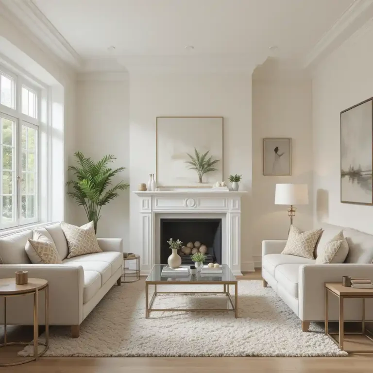
19 Corner Wall Gallery Ideas That Feel Genuinely Beautiful
A corner is probably the most avoided spot in any room. It’s not quite big enough for a full seating area, not quite small enough to ignore, so a lot of people just let it sit empty or shove a random plant there and move on. A corner wall gallery, done well, actually solves that problem better than almost anything else I’ve tried in a home.
What makes corners tricky is also what makes them interesting once you commit to filling them properly, two walls meeting at an angle gives you a chance to build something that wraps around a space instead of just sitting flat against one surface. That wraparound effect is honestly the whole appeal, a gallery that turns a corner reads as more dimensional than the same collection hung on a single straight wall.
Below are 19 corner wall gallery ideas built specifically around that awkward angle, not adapted from a straight-wall layout as an afterthought. Some are simple enough for a weekend, others take a bit more planning, but all of them are meant to actually solve the corner problem instead of just decorating around it.
1. A Diagonal Photo Line That Wraps Around the Corner
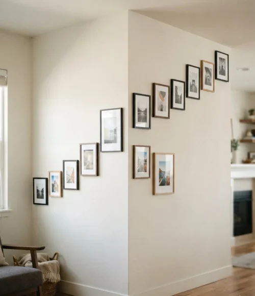
Instead of treating each wall of the corner separately, a single diagonal line of photos that starts on one wall and continues directly onto the other, crossing right over the corner seam, makes the whole thing read as one continuous piece rather than two separate galleries that happen to be near each other.
Getting the diagonal angle consistent across the corner takes a bit of measuring, but the payoff is a gallery that genuinely feels built for the space. Lay the whole thing out on the floor first, using painter’s tape to mark the wall angle before any nail holes.
2. L-Shaped Floating Shelves Built for Two Walls
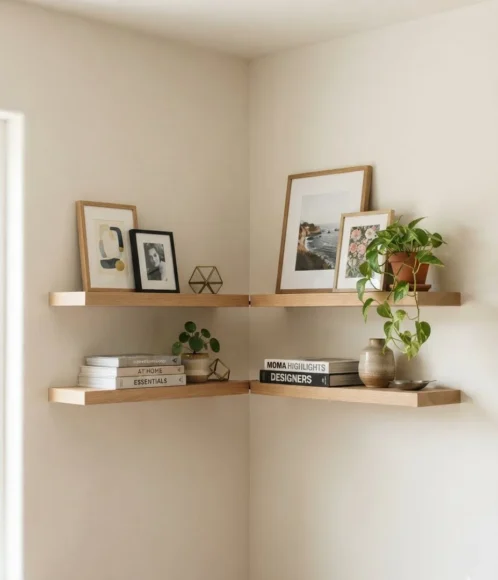
Two floating shelves, one on each wall of the corner, installed at matching heights so they visually connect even though they’re on different surfaces, gives you a place to actually display objects, not just hang flat art. Books, small plants, framed photos leaned rather than hung, all sit naturally here.
Getting the shelves to align
3. Mismatched Frames Tied Together by One Paint Color
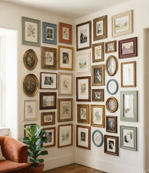
A genuinely mismatched collection of frames, different sizes, different styles, different eras even, reads as intentional rather than chaotic the moment every single frame shares one paint color. It’s the easiest trick in the whole gallery wall playbook, and it works especially well wrapping around a corner where the eye already has more to track.
Paint every frame the same color
Vary size and shape freely underneath that
Matching color but mixing matte and glossy
Inconsistent finishes undercut the unified look
4. A Vertical Gallery That Climbs All the Way to the Ceiling
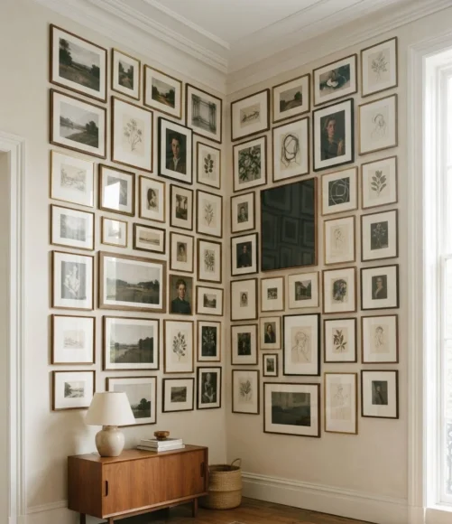
Rather than stopping the gallery at typical eye level, letting it climb the full height of the corner, right up to where the ceiling meets the walls, uses vertical space that almost never gets decorated.
It draws the eye upward and makes a room feel taller in the process.
| Eye-Level Gallery | Ceiling-Height Gallery |
|---|---|
| Safe, doesn’t change room proportions | Makes the room feel taller, more dramatic |
5. Black and White Photography Kept Deliberately Sparse
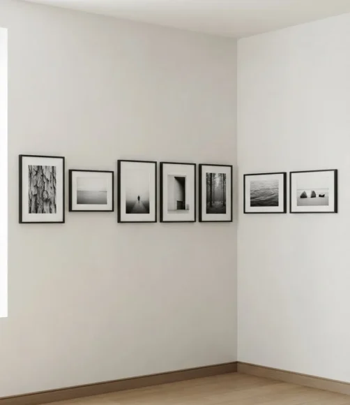
A handful of black and white photographs, spaced generously with real wall visible between each one, brings a quiet, gallery-like calm to a corner instead of the busier, denser look most people default to. Sparse spacing is doing a lot of the visual work here, more than the photos themselves.
6. A Round Mirror Anchoring the Center of the Corner
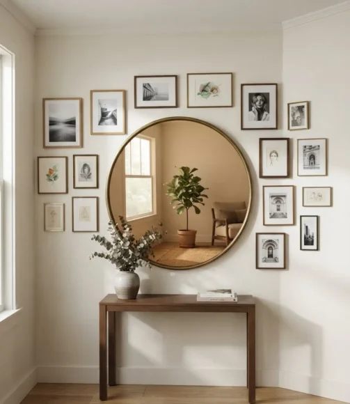
A single round mirror, placed right at the point where the two walls meet, gives the corner a genuine focal point and reflects light back into the room, which matters more in a corner than almost anywhere else since corners tend to catch the least natural light.
💡 Quick Tip
Hang the mirror slightly lower than you’d expect, right at the visual center of the corner rather than standard eye height, it reads as more intentional there.
7. Woven Wall Baskets Layered Between Framed Art
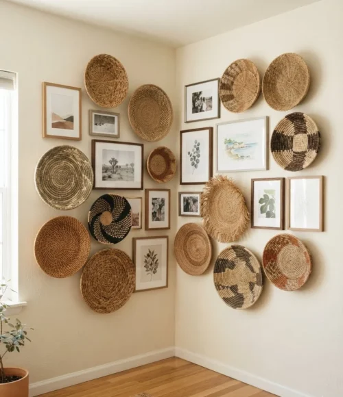
Mixing in a few woven wall baskets among framed photos and prints adds real texture and dimension that flat frames alone can’t provide, breaking up what would otherwise be a wall of identical rectangles with something that actually casts a shadow.
Tidy, but a little flat and two-dimensional.
Real texture, depth, and shadow added.
8. A Botanical Print Cluster Behind a Reading Chair
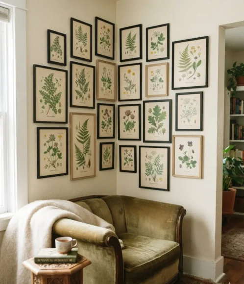
A tight cluster of botanical prints, framed simply and hung close together rather than spread out, makes a natural backdrop for a reading chair tucked into a corner, giving the whole nook a purpose beyond just filling wall space.
- ▸Keep prints in the same botanical family for cohesion
- ▸Hang them close together, tighter spacing than usual
- ▸Simple black or wood frames let the prints stay the focus
9. Family Photos Arranged in a Loose, Uneven Grid
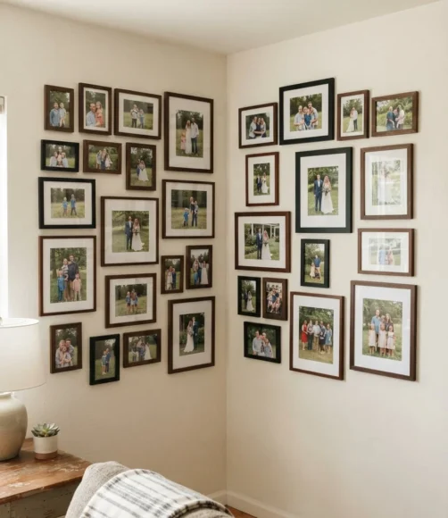
An intentionally imperfect grid of family photos, slightly uneven spacing, a few frames sitting a bit higher or lower than a strict grid would allow, feels warmer and more lived in than a perfectly ruler-measured layout ever manages.
Plan the imperfection on paper first. An unplanned uneven grid usually just looks like a mistake instead of a deliberate choice.
10. One Oversized Piece Instead of a Dozen Small Ones
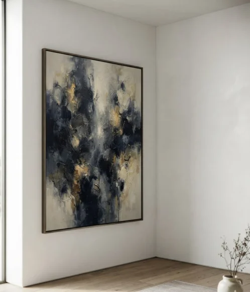
Sometimes the best corner gallery isn’t a gallery at all, it’s one genuinely large piece of art or a single big mirror that fills the space on its own. This works especially well in a corner that’s already fairly small, where a dozen little frames would just look cluttered.
📌 Good To Know
Measure the corner’s full height and width before shopping for the piece, oversized art needs real breathing room on both sides to read as intentional.
11. Postcards and Small Prints Pinned Like a Mood Board
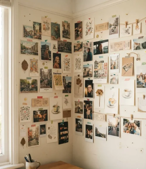
A loose, casual arrangement of postcards, ticket stubs, and small prints pinned directly to the wall rather than framed gives a corner a lived-in, collected-over-time feel that a formal gallery wall doesn’t quite achieve.
12. Circular Frames Mixed Into a Mostly Rectangular Grid
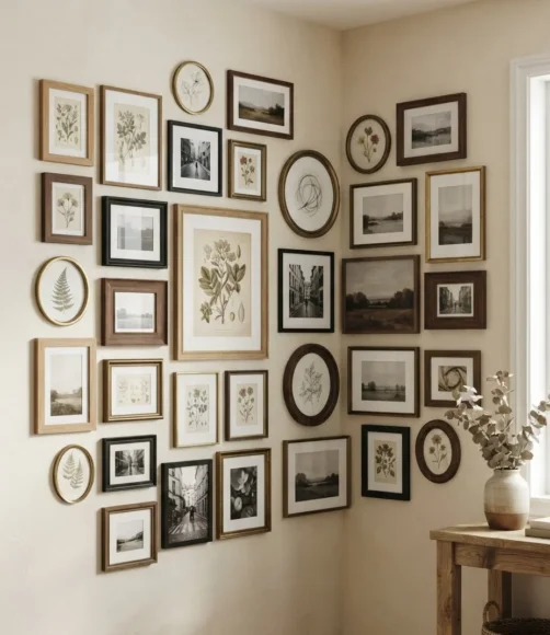
A few circular frames scattered among an otherwise rectangular gallery breaks up the grid’s rigidity without abandoning structure entirely. It’s a subtle detail, but it changes how the whole corner reads at a glance.
1
Keep circular frames to about a quarter of the total pieces.
2
Place them at slightly irregular intervals, not evenly spaced.
3
Match frame finish across shapes so the mix feels intentional.
13. A Corner Built Entirely Around One Bold Color
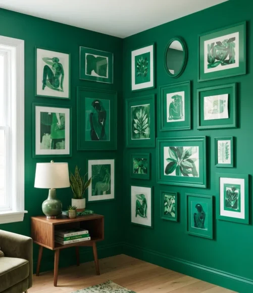
Rather than mixing frame colors or styles, committing an entire corner gallery to one single bold color, frames, mats, even a painted accent behind them, creates a genuinely striking focal point that a mixed palette corner can’t quite match.
Choose one saturated color for the whole cluster
Apply it consistently across frames and mats
Mixing in a second competing bold color
It undercuts the whole focused effect
14. Art Ledges Swapped In for Traditional Hanging
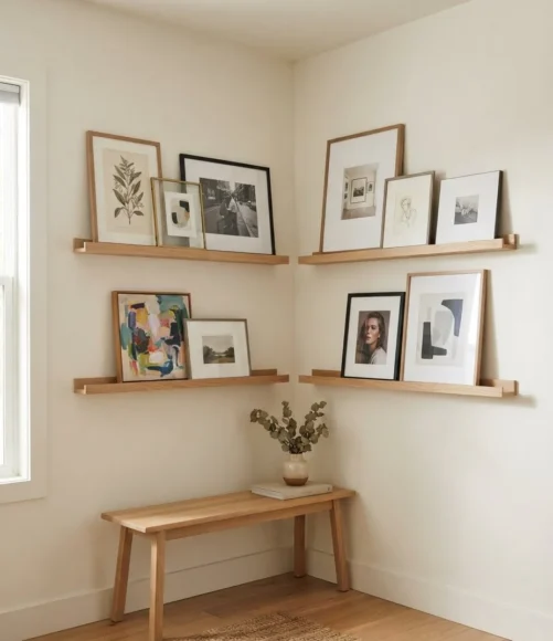
Narrow floating art ledges, rather than individually hung frames, let you lean and layer pieces instead of committing to permanent nail holes, which makes rearranging the whole corner as easy as picking pieces up and moving them.
Styling art ledges well
15. A Travel Map Paired With Framed Trip Photos
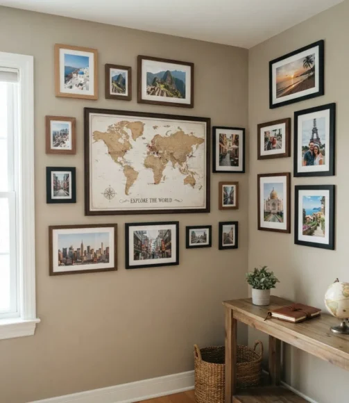
A large framed map, marked with pins or highlights from places you’ve actually been, paired with a handful of photos from those same trips, turns a corner into something genuinely personal rather than purely decorative.
16. Textured Fiber Art Filling an Awkward Empty Corner
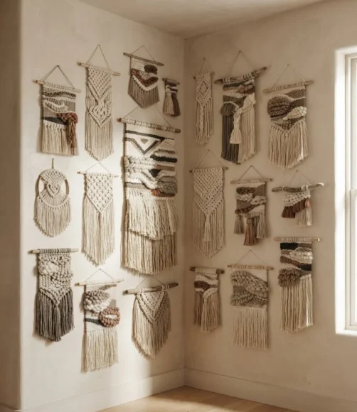
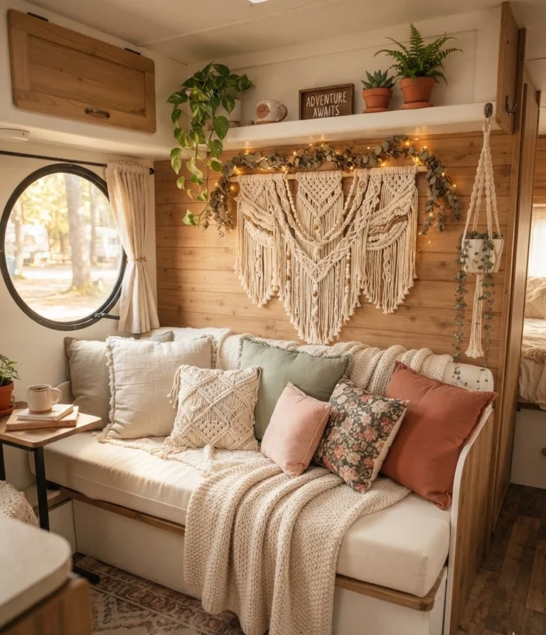
Woven or macrame fiber art, hung to fill the vertical space of a corner rather than framed flat pieces, adds dimension and texture in a way that photography alone never quite manages.
It also happens to catch light differently throughout the day, which flat art simply can’t do.
| Framed Art Only | Fiber Art Added |
|---|---|
| Flat, two-dimensional feel | Real texture and depth, catches light |
17. A Kid’s Gallery Corner Built to Grow With Them
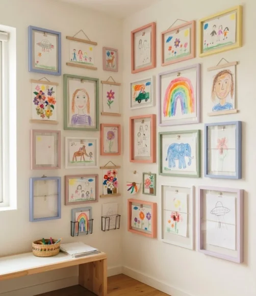
A corner dedicated to a child’s artwork, rotating drawings held in simple clip frames rather than permanently mounted pieces, lets the gallery actually grow and change with them instead of becoming outdated the moment their style shifts.
Fixed, quickly outgrown as tastes change.
Grows and updates naturally with the child.
18. A Symmetrical Layout Split Evenly Across Two Walls
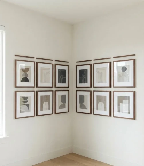
For anyone who prefers order over the loose, uneven look, mirroring the exact same arrangement on both walls of the corner, same frame sizes, same spacing, creates a formal, balanced gallery that still uses the corner’s full wraparound potential.
- ▸Measure and mark both walls identically before hanging
- ▸Keep frame sizes and spacing perfectly matched
- ▸Works especially well with a formal or modern room style
19. A Window Corner Framed by Art on Both Sides
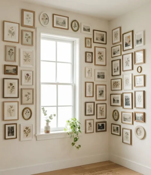
When a corner includes a window rather than two solid walls, framing the window itself with smaller pieces of art on the adjacent wall space turns what’s usually treated as unusable into a genuinely styled little vignette.
Keep pieces near a window smaller and lighter in frame color, heavy dark frames compete with the natural light coming through.
Final Thoughts
A corner wall gallery works because it treats an awkward, usually ignored part of a room as an actual opportunity instead of a problem to work around.
Whether you go with a loose, collected mood board or a precisely mirrored symmetrical layout, the corners that end up looking the most intentional are the ones planned around the actual angle, not just decorated as an afterthought.
Start by taping out your layout on the floor before a single nail goes into the wall, and don’t be afraid to let the gallery wrap fully around the corner rather than stopping short. Save this list for the next time an empty corner has been staring back at you.